
By Michael Vandi (Data Science Corps Fellow, 2020)
In the era of data-driven decision making, an intrinsic part of data analysis means understanding what is in the datasets to begin with. However, as data analysis becomes a quotidian task, and datasets get continuously larger, data scientists may develop an instinct to skip some elementary steps in the data analysis process. Picture this: It’s 8:00 AM, and you just received a considerably large amount of datasets to analyze for a client with no concrete instruction but to dig around and see what you can find. So you immediately have the urge to open SPSS or RStudio and start doing some preliminary analysis on the datasets. Trust me, I have been there. Whenever I get new datasets, the data geek in me gets excited to jump in the data and start making averages, sums, projections, and graphs like a raccoon scouring through a dumpster looking for left-over pizza. As exciting as this activity may sound, it is important to first read the documentation before even touching the datasets. If there’s no documentation (which often is the case when working with non-profit organizations), the first step is to make one! Ask yourself: what is the dataset about? What are the conventions used? Are there any inconsistencies? Data documentation may sound trivial but it is a fundamental step in the analysis process.
Getting Started with Metadata
I recently worked on a project to analyze survey data for an organization called Code for Baltimore, which helps teach school-age children in Baltimore about coding. The responses in the data consisted of pre-survey and post-survey data collected over three years. My goal for this project was to build a dashboard and create a continuous integration pipeline for future surveys. There was no documentation or metadata for the datasets so I had to make one. While creating the documentation, I found two common mistakes that may be ubiquitous to many other datasets:
- Likert scale values had irregular ranges for the same question over the three years.
- Survey questions were also inconsistent over the three years.
Inconsistencies in survey questions ranged from subtle one-word changes in a question every year, to extensive contextual differences on two lexically similar questions. For instance, in one year, a survey question might be: “What are your plans for the fall semester?” and in the following year, the question above is modified to: “What will your educational status be in the fall?”
While these two questions are aimed at getting similar responses, they are contextually different, and may prompt different responses in events where one respondent’s idea of “plans” may be different from another respondent’s idea of “educational status”. Now, it’s up to the data scientists to determine what the connection is between “plans” and “educational status”.
Visualizing Metadata
It is acceptable for standards and terminologies in data to evolve, but this evolution must be documented. My first step was to select a consistent range for Likert scale values then construct metadata containing an overall description of the dataset, a list of columns and their description, and relationships between similar survey questions. Yet, something felt missing… the metadata document did not provide a picturesque representation of the datasets. So I made an interactive timeline visualization of how the survey questions evolved over the years and how they interact with each other. The code for the visualization was written in React.js (a JavaScript framework for building web applications). It contains a simple class component that takes in an array of column names and a JSON object with key-value pairs specifying the relationship between any two columns. Then it renders dots representing the columns and connects the dots with arrows to link similar columns. The app is hosted at https://codeworks-mapping.web.app/ and the source code can be found here: https://github.com/MichaelVandi/connect-the-dots.
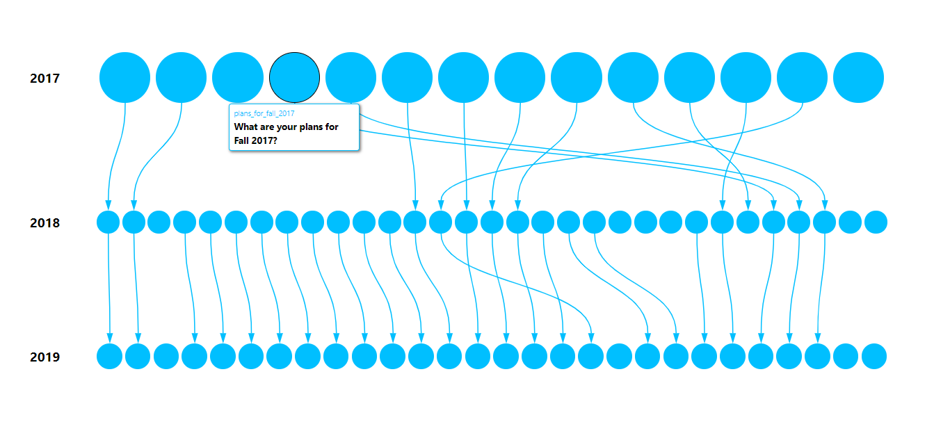 Figure 1: Change in survey questions over time
In the above visualization, each blue dot represents a particular survey question and the arrows connect similar survey questions from 2017 – 2019. Hovering over a blue dot will display a tooltip containing information about the specific survey question it represents and its corresponding column name in the dataset. This illustration provides an intuitive overview of how the survey data evolved more comprehensively than the primarily text-based metadata document.
Clarity improves efficiency
Constructing documentation for the survey data in this project helped me familiarize myself with the dataset. I could easily recall the column names, survey questions, and descriptions without searching through the dataset. This generally helps simplify the analysis process as I could better navigate the data, know whether some specific information can be elicited from it, and easily reference the timeline visualization to verify the relationship between the survey questions. Also, the compact nature of the visualization makes it easier to isolate snapshots of individual column relationships which serves as a guide during data analysis, allows for errors to be easily recognized, and ultimately shortens the total time spent on analysis.
![]()
Data Analysis
We used Airtable to aggregate, analyze, and manage the datasets. Creating metadata streamlined the process of identifying and analyzing trends that encompassed tiny pieces of data from pre and post-survey responses over the three years. For example, survey questions like “What are your plans for the fall semester?” and “What will your educational status be in the fall?” were merged into a single column called “educational_status_in_fall” and the following bar chart was made from the responses obtained.
Conclusion
The tendency to assume documentation is not important is understandable, after all, documentation seems like a redundant and time-consuming task. However, after working on this project, I now appreciate the value of documentation. The human memory is fragile and documentation serves as an archive for future references. Not only does it give a comprehensible perspective of data, but it also shows that you’re a dedicated professional. In the end, constructing documentation is not simply following protocol. While it may feel incredibly redundant and time-consuming, the underlying benefits it offers to a project are worthwhile.